Thursday 30 March 2017
DGA260 - Clockwise Grandfather Clock Designs
Some digitally drawn grandfather clock designs. I think they're okay, but perhaps they should be more stylised. I'll speak to Amy and see what she thinks. Also, my Wacom tablet isn't that great so some lines are quite shaky, I might re do them in the studios as the equipment is much better! I'm really getting into Photoshop at the moment, I haven't used Krita in a while because lately, my first "go to" is Photoshop but I might use Krita again as it is such a good software. I'm surprised the studios don't have it. So yeah, clocks. I think the colours are quite plain too, needs more of a variety and more textures maybe? I don't know I'll get some feedback from Amy first and go from there.
Monday 27 March 2017
DGA240 Live Brief - Smoke animation
Thursday 23 March 2017
DGA240 Live Brief - Windmill Animation
So, I've been doing more of the pre production side of this project because unfortunately, for me, animation is just a no no. However, I thought to myself, I wont be good at animation unless I practice, so although a few of the other members of the group already have the animation sorted, I thought i'd do a quick test of a windmill - baring in mind I haven't animated since before Christmas, and I haven't used flash since first year so about a year ago. To be honest, It turned out okay except for the fact that it's shaky and it kinda moves around a bit but it wasn't a complete disaster at least! I think I might do more of this kind of stuff because I do need to get into animating a bit more even if I am more of a pre production kinda girl. Challenge accepted.
Monday 20 March 2017
DGA260 - Fern's Project
I have to admit, I'm low key struggling with this. Fern has told me to look at Pascal Campion for inspiration but I'm not sure how to incorporate his style into the backgrounds, I feel like I want to just go into Fern's brain for a moment just so I know exactly what kind of style she's after. So anyway, I just messed around a bit here, my work is on top and then below is one of Campion's illustrations that I used as reference. The colours I used are a bit unusual, especially compared to Campions. But I used the photoshop extension - Adobe colour themes which suggested complimentary colours. I'll have to ask Fern for feedback but I have a feeling this is not what she's looking for, however she may like it and it might be something we can work with! we shall see!
Friday 17 March 2017
*Mucha Appreciation Post*

Epileptic
 So, I have a bit of an idea for a film, it's quite a personal one. I have a form of epilepsy and I was researching trying to find animations about or to do with epilepsy and there was barely any, the only ones I found were 10 second ones on the NHS website and they were just informative animations. I spoke to Kathy and Derek and they liked the idea and to just do some sketches and concept art. my coursemate told me to watch a few films which I'm going to do for inspiration.
During seizures I blackout and it made me think, what happens during this blackout? (apart from shaking and weird stuff of course) So I thought my main character could be epileptic and go into this dark and creepy dream world during the seizure and then wake up in the hospital? it's not set in stone yet and I still need to figure out a proper story but I definitely want to centre it around epilepsy, lets see what comes of this! :)
Thursday 16 March 2017
Clockwise part 2
Clockwise
So as well as Fern's project, I've decided to join Amy's gang as I really liked her idea from the very start and just had to work on it! This is a bit of concept art I did on Photoshop. This project is still very early on in terms of a story and environments - but hey, it's a start!
Monday 13 March 2017
DGA260 - Bug Whisperers Ella
Okay so what's up with these hands? could be a lot cleaner but I'm really enjoying this cut out style! I think I might experiment with other stuff like trees and backgrounds, too
DGA260 Bug Whisperers Riguez
Not sure how I feel about this one... I feel like the design of the character needs more development, but for now, this'll do! :)
Tuesday 7 March 2017
DGA260 - Bug Whisperers Hobbs
I did another cut out of the mole and it's working quite well, the only thing I'd say is that the feet look a bit too flat but other than that I think this is pretty cool! I think I'm going to try with the other characters too and do a line up with all of them
Monday 6 March 2017
DGA260 - Bug Whisperers Fianna
So I thought about how i usually outline my drawings in black and decided to try something different with the characters, so i tried the cut out style and i think it was a success! I'm actually really happy with this and I'll definitely have a go at this with other characters.
DGA260 - More Bug Whisperers designs

 These are some designs for a scroll, there wasn't really many ancient symbol fonts on photoshop and when I tried to load a font it came up with a log in for staff, so this font was as close as I could get to an ancienty type font. I liked layering textures and colour to create the old paper coffee stained ripped scroll look. I usually have a habit of outlining drawings in black but when I hid the layer, it actually looked pretty cool without, then I realised the outer edges of the scroll were too neat so I added a few rips here and there. I can imagine Ella the mouse with this scroll. Maybe with some old family writing?
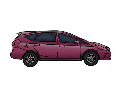
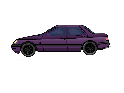
DGA240 - Live Brief/Eco Project Cars
Some car designs playing around with different colours. Trying to stick to the same colour theme as the street. Not the best clean ups, for some reason I struggle to get my lines smooth? maybe I need to play around with photoshop a bit more and see if there's anything I can do to change that, there may be some settings or something that'll change the smoothness
DGA240 - Live Brief/Eco Project. The 'Boss' Cloud development
So, now that the storyboard is done, I'm just going to do some development work on cloud and work on some facial expressions. Here are two colour ideas for the cloud, I think the bottom one (grey) is better as it gives a better impression that the cloud is a bad character and usually people subconciously associate pollution more with grey clouds rather than white.
****I've just realised after publishing and then viewing the post that my colouring goes outside the lines, wow my colouring is atrocious.... sorry!!*****
****I've just realised after publishing and then viewing the post that my colouring goes outside the lines, wow my colouring is atrocious.... sorry!!*****
Subscribe to:
Posts (Atom)


