Wednesday 21 February 2018

Ticked Off - Control Panel

Above: with overlay
Below: without overlay

   So because Jasmine had already designed the props before i jumped onto the film to do backgrounds, my work is basically cut out for me, I just need to place the props in the right position for each background and i'm basically done. So, Jasmine said I could design the control panel. I'm happy with the design but i just can't get the colours quite right as with the pink textured overlay the colour brightens and changes. jasmine said to use copper/gray colours with a wooden texture and then another one with a metal texture. I'll have to see what she thinks. To see what the control panel would look like in a background, i did a quick test but went a bit overboard by adding the characters (oops) I also added a bit of gaussian blur to the background so that the foreground and characters stand out and to add a bit of depth. This is only rough as i know that the outside of the clock will change, the cog system will be a different design, in 3D and textured (but i just drew a random design as line art for this test) and also the way the clock face has smashed will change, but it's just to get a feel of the whole thing and i think the control panel looks okay, but it's Amy's vision so i'll have to double check with her! I'm pleased with this though and I can add this to my portfolio anyway if it isn't used!

To see more of how Ticked Off is going, you can check me out on social media: Twitter: @cerysjanemees Instagram: cerysjanemees and Facebook: Cerys Jane Mees

You can also check out Producer of Ticked Off, Jasmine's blog: http://jasminemayanimation.blogspot.co.uk/ and follow her on Twitter: jasminemay987

and last but not least our lovely director Amy!: Blog: http://amydoesanimation.blogspot.co.uk/

You can follow Ticked Off on twitter: @tickedoff2018
Monday 19 February 2018

Ticked Off Backgrounds


These are new backgrounds for Ticked Off. The bottom one is a new angle of the previous background i did, the clock is supposed to be cracked but Jasmine is still working on the design of the cracks in the clock so i put the full clock face in as a placeholder. I think they're looking really good, although i can't help but think they're a little too saturated? I still need to finish the top one so it's in progress at the moment but i'm happy with it so far!

Thursday 15 February 2018

Ticked Off - Background

This is a background that I've done from a layout which was done by our producer, Jasmine Scrogie. This is my first attempt at a background in the final style as the test I did last semester was in a very different style to this one., there are new textures and overlays and also new props. In the shot for this background, the clock face is actually smashed at this point but Jasmine is still working on how the clock will be smashed so I've used the proper clock as a placeholder. I think it's looking really good and i can't wait to do some more!

Wednesday 14 February 2018

Papa Poule - Character work pt2

   Another one! This one i found more tricky than the others, i'm just awful at perspective and shape and body proportion, which is why i''m more of a background artist but I've enjoyed the challenge and this has to be done to make my work more appealing to look at! just have to keep going and not give up! D:

Tuesday 13 February 2018

Papa Poule - character work

   So i'm thinking a lot about how i'm going to tell a 'story' through my portfolio of work that i hand in at the end of the semester, and i'm thinking i could just use the characters and make them interact with whatever i'm showing  so for example, painting the backgrounds and then i had an idea of making the characters from different films meet, so Paul would meet Wick and so on. These are three of the poses I've done and so far it's looking pretty good, i'm not usually great at character stuff but i'm quite enjoying it! Definitely not perfect but better than i thought.

Friday 9 February 2018

Papa Poule - shot and layout change


 So layouts and backgrounds are all done now for Papa Poule, so for me it's just a case of fixing any layouts/BGs that need fixing and tweaking things here and there. I also said i'd help out with colouring shots if needed, even though I specialise in backgrounds. This shot that requires two backgrounds has changed so the blinds aren't going to be animated anymore so I've just added the blinds on each one.


Ticked Off - Coloured Bookshelf


These are the bookcases coloured in basic block colours, I need to touch base with Jasmine, our producer who designed the props, as I was using her design as reference and she seems to have used some sort of texture and other brush that I don't know about (Jasmine's example shown below) and of course, consistency throughout the film is important so I need to make sure we're both using the same brushes and techniques to keep the style exactly the same. I'm actually really pleased with these, I have definitely surprised myself in terms of what I am capable of - I know they're just a bunch of basic bookcases but considering that I struggle with angles I'm pretty proud of myself I must say.

Thursday 8 February 2018

More Props for 'Ticked Off'

 The table is right in front of the clock and basically in the centre of the room and is visible in many of the shots so I thought I'd practice drawing it at different angles. The props I've put on the table in this will change in the final backgrounds but I thought i'd add them on to help show the angles of the table and because it looks pretty.
 Boxes again but with different background and texture/colour overlay. I need to do more angles of this.
Bookcase: I was worrying about this one because it's quite a difficult thing to draw at different angles (I think so anyway) but I think I pulled it off? I'm happy with it anyway. I didn't draw any of the books or objects inside as I just wanted to get the basic shape of the bookshelf first and the rest can easily be added later. Now all I need to do is colour them! We don't really see the back of the bookcase but I thought i'd add it in to the turn around, to really get a feel of the design.

Monday 5 February 2018

Props for Ticked Off

   So I'm struggling a bit with the layouts for Ticked Off as it's difficult to draw the props at different angles, especially because there's so many and you have to be accurate with the position of each prop and blehhhhh. So I've decided to do some prop turn arounds to help me with the layouts. This box thing took me so long because i'm still getting used to the style and no matter how many times I tried, I just couldn't get the right angle, it just looked wrong, then I realised that it's basically the same shape as the front view....I think i'm done for the day, I have a headache.

Thursday 1 February 2018

Ticked Off - Layout of clock

   I started creating a layout for the clock as layout and background artists need to know where everything is in the room. I'm still getting used to the style and not everything is set in place yet like the textures and props and clock face but I'm working with it for now and using placeholders. Hopefully I can finish this but it isn't a priority at the moment because I'm working on the layouts from 3D screenshots that Jasmine and I did together yesterday.

Papa Poule Backgrounds


 Above: This is an improved version of the background I've already attempted last semester. I struggled getting the pattern right for the floor but Lucie made a png of the texture so I just imported tat into photoshop which is so much easier and quicker. I think I might go back into this though and add some shadow under the table as at the moment it looks like its floating.
 Above: this is a background I did for one of the shots which has now been changed into a parallax. So I've gone back into the layout for this and extended the canvas to the left and upwards so i'll have to recolour it because for this one the colour for the foreground and background is on the same layer, how annoying! but it's okay hopefully it won't take me too long

 Above: These two backgrounds in different colour palettes are for the same shot, the shot where the blinds go up. The blinds aren't there because they're going to be animated but hopefully it'll work if we do some kind of fade into the other palette.
 This layout above was drawn by someone else and was also coloured by a second year student but turns out we needed another version of it in a different colour palette so I did this one just by using the bucket tool. The duvet isn't there because it's going to be animated
    This is the shot that had to be redone because the perspective wasn't right, its so nice to see all the backgrounds being done and coloured because you can really get a sense of the environment and realness of the room.
 This is purposely unfinished because it turns out someone else had already coloured it. This was simply just a bit of miscommunication, as I did the layout I was under the impression that I had to colour it as well so I started and then realised when I looked at the shot list that it had ben assigned to someone else and it had already been done. I think I might finish it anyway as there's not a lot left to colour and I can add it to my portfolio as a finished background
This is for the end shot of the film. I added a bit of shadow under the table so it doesn't look like it's floating and I'm really happy with it.

I have returned

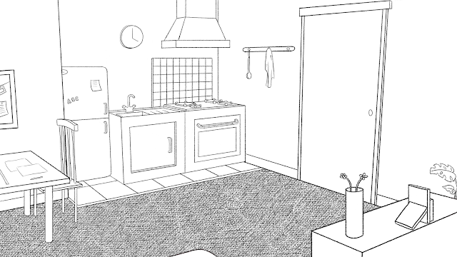
So I haven't been on here for quite a while, since my last post I've been working really hard on more layouts and backgrounds for Papa Poule and this semester I've moved on from Landlubber and joined the Ticked Off team on layouts and backgrounds. Here are some Papa Poule layouts I've done. I think they're going quite well. Sometimes I struggle to get angles and perspective right but for the most part I have the 3D model as reference for the main objects in the room like the bed, door, table etc, and Lucie and Kathryn seem to me happy with them which is great!


 This one above is going to be a parallax shot so I redid the layout and extended the canvas and made sure to separate the foreground from the background. I just need to check if there are any problems with it with Lucie and if it gets the all clear then it's ready to colour! :)

The 2 layouts above are for the same shot but when Lucie added the first one to the shot that has been done, it didn't look right so she changed the perspective and I think it looks a lot better.